Most authors think about their cover too late and too literally. They have spent years writing a book and naturally want the cover to reflect its contents — to show the reader, in some direct way, what the story or argument is about. This instinct is understandable and almost always wrong.
A cover does not illustrate a book. It sells it. These are fundamentally different tasks, and confusing them is the source of most bad cover design. The cover's job is not to summarise — it is to attract, to signal, and to promise. What it promises must be true, but the promise itself is made through feeling and impression, not through literal representation.
The cover as communication
Every element of a cover communicates something to a prospective reader — whether you intend it to or not. The typeface carries connotations of period, class, and tone. The colour palette triggers emotional associations. The composition — where the eye is drawn first, what is foregrounded, what is suggested rather than shown — creates a mood before a single word is read.
A reader browsing a bookshelf or a digital storefront is processing these signals rapidly and largely unconsciously. They are not asking themselves "does this cover accurately depict the contents of this book?" They are asking "is this book for me?" The cover answers that question visually, in an instant, through the accumulated weight of every design decision made.
A great cover doesn't show you the book. It makes you feel why you need to read it.
The four essential elements
Every book cover works — or fails — through the relationship between four elements: the image or visual treatment, the title typography, the author name, and the use of space. Each of these has its own set of considerations, and the skill of cover design lies largely in how they are balanced against each other.
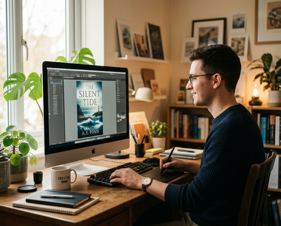
- Image or visual treatment — the dominant visual element sets the mood and signals genre. It need not be a photograph or illustration; texture, colour, and abstract form can be more powerful than literal imagery for many types of books.
- Title typography — the typeface is not neutral. A serif font in a classical weight says something entirely different from a hand-lettered script or a stark sans-serif. The size, weight, and placement of the title affect whether it commands attention or recedes into the background.
- Author name — for debut authors, the name is typically smaller and subordinate to the title. For established authors with an existing readership, the name may be the primary selling point and should be treated accordingly.
- Space — what is left out of a cover is as important as what is included. Overcrowded covers signal amateur design. Generous, intentional use of negative space signals confidence and quality.
Genre, expectation, and when to break the rules
Every genre has a visual language — a set of conventions that readers have come to associate with certain types of books. Literary fiction tends toward restraint: spare typography, suggestive imagery, muted or carefully considered palettes. Thrillers favour high contrast, bold typography, and a sense of tension or movement. Memoir often uses portraiture or personal photography. Romance has its own distinct codes that vary significantly by subgenre.
These conventions exist because they work. They allow readers to identify relevant books quickly and feel confident about what they are buying. Departing from them entirely is a risk — a literary fiction cover that looks like a thriller will attract the wrong readers and disappoint them, which is worse than attracting no one.
That said, the most memorable covers are often those that work within genre conventions while doing something unexpected with them. They speak the right visual language but say something new in it. Finding that balance — familiar enough to be recognised, distinctive enough to be remembered — is the central challenge of book cover design.
Briefing your designer well
The quality of a cover design depends significantly on the quality of the brief the designer receives. A vague brief produces a generic cover. A precise, considered brief — one that articulates the book's tone, its intended readership, its position within its genre, and examples of covers the author responds to — gives the designer what they need to make something genuinely distinctive.
- Describe the mood and tone of the book in three to five adjectives — not plot points
- Identify five covers in your genre you admire and explain specifically what works about each
- Identify two or three covers you actively dislike and explain why
- Describe your ideal reader — age, reading habits, what else they read
- State clearly where the book will primarily be sold — print, digital, or both — as this affects design priorities
A designer who understands your book's world and your readers' expectations can make something that serves both. That is the goal — not a cover you personally love, but a cover that makes the right readers pick up your book.